
Songs 4 Soldiers: Website Redesign (Key Pages)
There is no exercise better for the heart than reaching down and lifting people up. -Veteran John Holmes
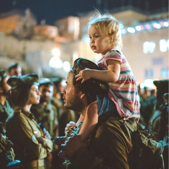
Not everyone has the will to ask for help. From rent and bill payments to home maintenance, there are many veterans going without the necessities of everyday life. Songs 4 Soldiers (a not for profit) honors the service of combat vets by providing financial support for their everyday needs. And by reinforcing the understanding that there is no harm in seeking assistance.
the challenge
Songs 4 Soldiers’ major fundraising event, a benefit concert, was two months away and its management team had three primary goals to support its success: increasing attendance (new and returning), increasing donations (while encouraging recurring donations), and increasing following and engagement of social media channels. They turned to OBP (an advertising agency and major donor) for help. OBP’s 11 summer interns (myself included) took on this challenge.


My Contribution
Analytics | Task Flows | Site Audit | Competitive Audit | Personas | Information Architecture | Wires
Strategy
Of the three goals the client had for the website, my team focused on “how to increase one-time and recurring donations” for the following reasons:
Improving the donation experience on the site would benefit the client more in the long term because fundraising efforts are made year round
The younger age and technical proficiency of the primary target audience reflects their preference for making donations online rather than by other methods.
However, if more time were available for me to take a deeper dive into how the website could better support the other two asks, it would be valuable to do so. Other interns alleviated the limitations required here, by focusing on how all three goals might be supported in their own fields of specialty, which included: social media, public relations, email, and experiential.

UX Design
Donations Task Flow
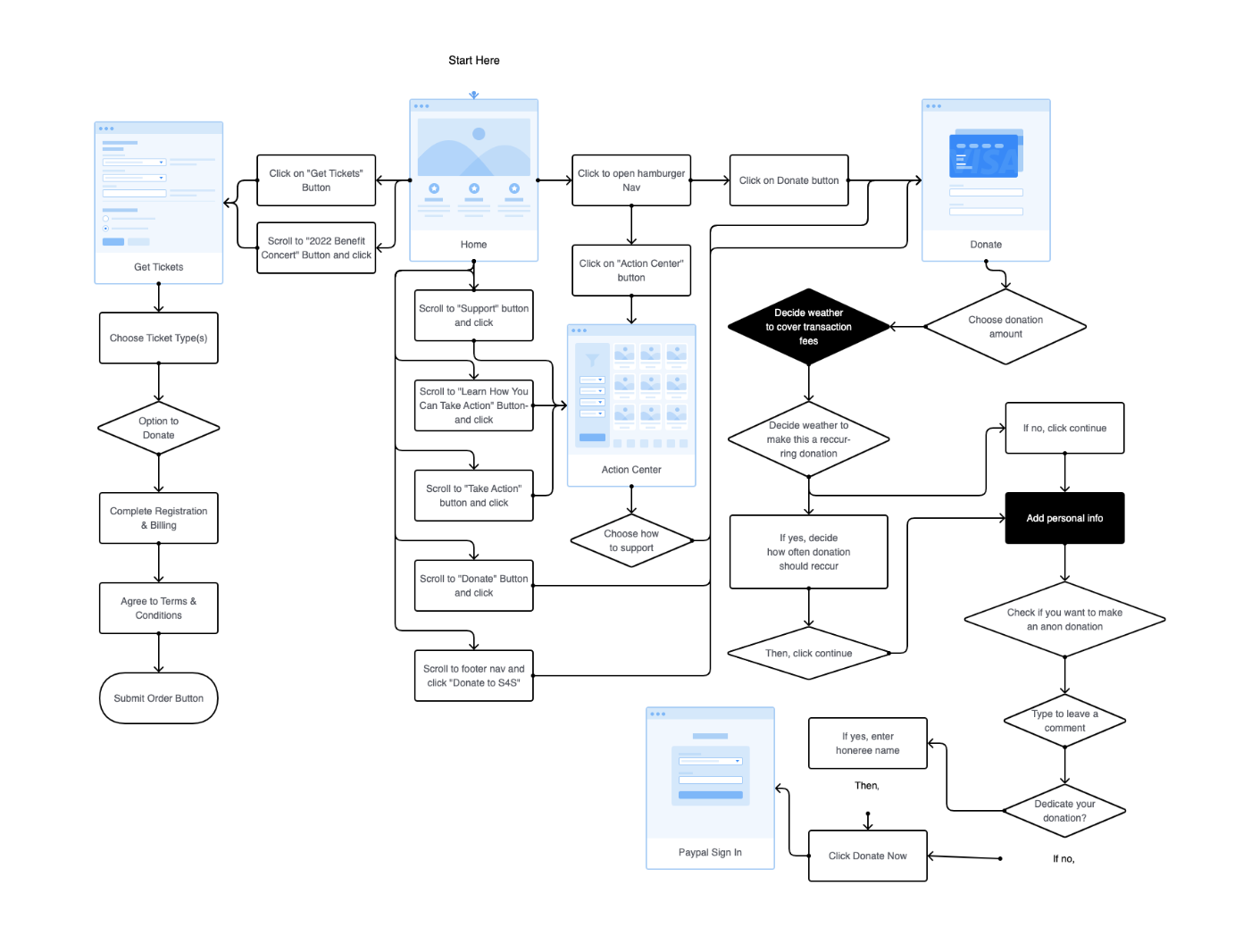
Findings: The user can make a donation on the Songs 4 Soldiers website through the following pages: the homepage, the ticket purchase page, the support page (called the “action center”) and the donate page.

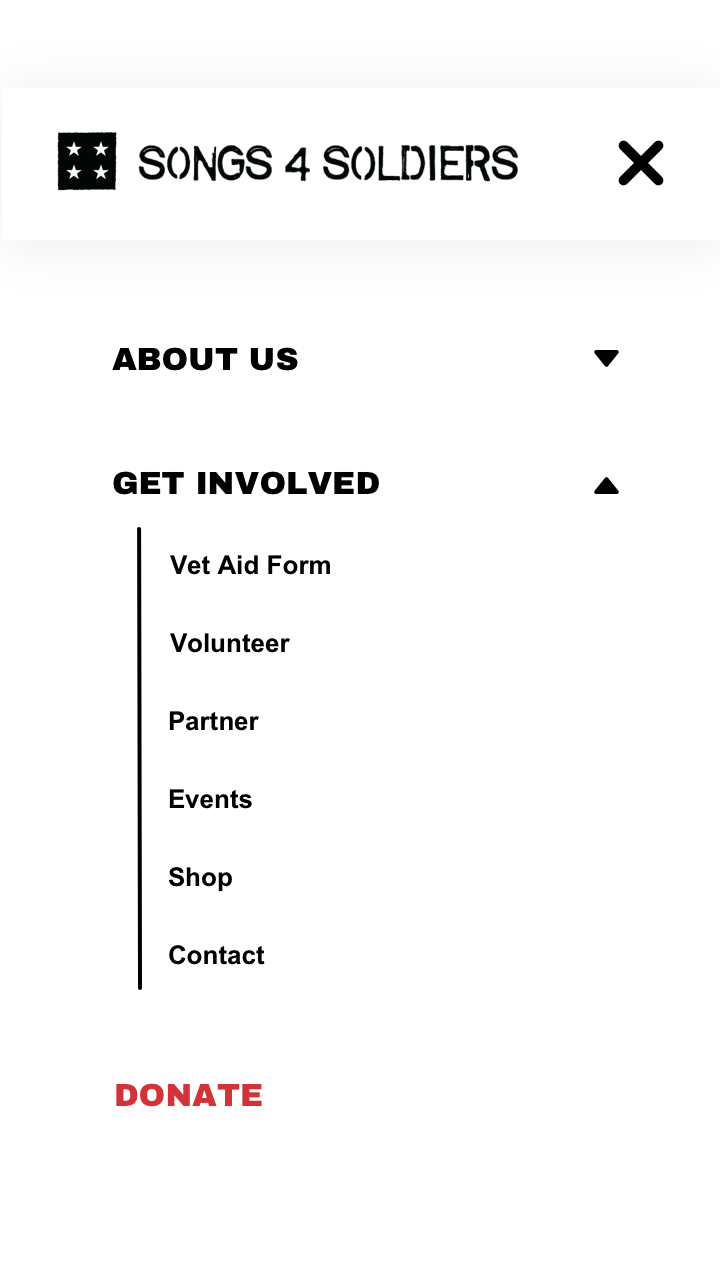
Main Navigation
Audit Findings
With no main CTA, the site was missing a major opportunity to accomplish its goal of increasing donations
1
The entire main navigation on the desktop was hidden behind a hamburger icon, potentially limiting a users ability to quickly find content
2
A page in the navigation called “Action Center” showed users all options available for supporting Songs 4 Soldiers. The title might leave users unclear about what the content of this page would be
3
Main Navigation

Medium Fidelity Wire Recommendations
Removing content from behind the hamburger icon on the desktop
Adding a main CTA to the nav labeled “donate” to support the client’s primary goal of increasing donations
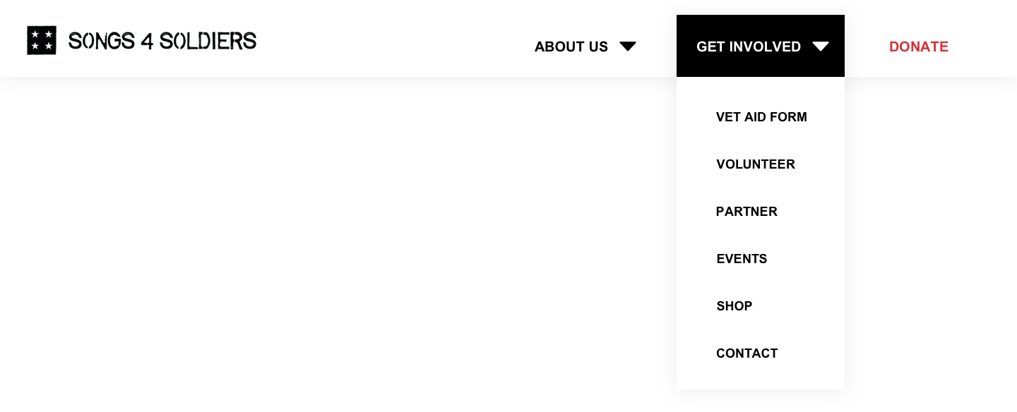
Changing the “Action Center” page’s name to “Get Involved”. And adding a dropdown interaction on hover to enable the user to quickly see all the ways they can get involved.
Placing the “Vet Aid Form” at the top of this dropdown since analytics data showed it was the most utilized CTA on the page.


Audit Findings
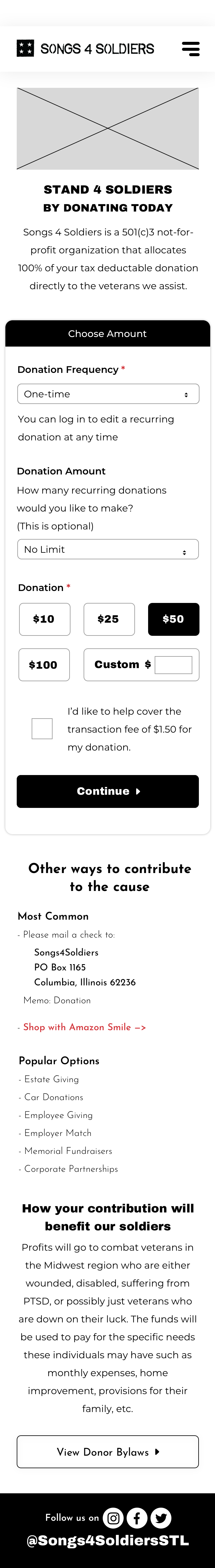
Donate Page
Content related to the donation frequency and (recurring) donation amount were listed after the user chose which amount they wanted to donate. This is counterintuitive.
The donate page doesn’t highlight how the user can cancel a recurring donation, potentially reducing user trust in making a recurring donation.
“Why Donate” is located so low on the page that most users are likely to overlook it.
Mid Fidelity Wire Recommendations
Placing donation frequency and recurring donation amount before “donation”
Informing the user of how they can cancel a recurring donation before they make one (this recommendation was made but not built out fully in all the designs as per the recommendation of my supervisor, in an effort to save time)
Placing information most relevant to why the user should donate near the top of the page, but keeping that content brief to reduce the time it takes to for the user to achieve their goal

Home Page
Audit Findings
The user may not be convinced that Songs 4 Soldiers is the best organization to support because there is not enough content specifying what it has done for vets. Note that vet stories have the lowest percent exit rates on the site, showing that users find this content engaging, and it makes them want to learn more.
How veterans can apply to receive support is hidden by being placed beside multiple CTA’s without clear labels. This may make it harder for vets to figure out how to apply.
The events page is not populated with upcoming events, yet it is the second CTA on the page. Visitors to this page may be dissuaded from exploring more of the site- potentially thinking it is not updated enough.
Mid Fidelity Wire Recommendations
Place veterans’ stories higher on the page to increase user engagement and understanding of what Songs 4 Soldiers does, and how effective it is at supporting veterans.
Help vets easily determine how they can apply to receive support.
Until the events page is able to be regularly updated, place it lower on the page.


Action Center Page
Audit Findings
Excessive, hard to read, and ill placed content potentially increases users cognitive load while hampering their ability to understand what they can do to support Song’s 4 Soldiers or gain support from them.
Recommendation
Remove this page from the website and place all options to get involved in the main navigation.
Measuring Success
This project came to an end after audit findings and wire recommendations for the site were presented to the client (along with other interns’ non web recommendations). Had the web recommendations been implemented, here are the metrics I would have measured to determine if the redesigns had helped the Songs 4 Soldiers team achieve their goals:
Key Performance Indicators (Web)
Get Tickets Clicks
Donate Page Clicks
Donate Now Clicks
Veterans Aid Form Submissions
Supplementary Metrics (Web)
Engagement Rate
Unique Visitors
Client Goals
Increase donations
Increase following and engagement of social media channels
Increase new and returning attendees
Project Team
Web Team
Analytics Director
Jeremy Leber
Analytics Intern
Ming Xue
UX UI Designer
Jess Bellatti
UX UI Intern
Saameri Anderson
Other Team Members
Content Tech Intern
Alex Johannes
Media Intern
Anna Jost
Account Intern
Annee Mattson
Account Intern
Corrie Fauller
Media Intern
Finna Xu
PR Intern
Kayla Powers
New Business Intern
Veronica Hsiao
Art Intern
Sydney Kunz
Activation Intern
Mattie Kotman

(202) 904 - 9865 saameri.anderson@gmail.com
Saameri Anderson