OBP Agency
UX Case Study Content Hierarchy & Wires
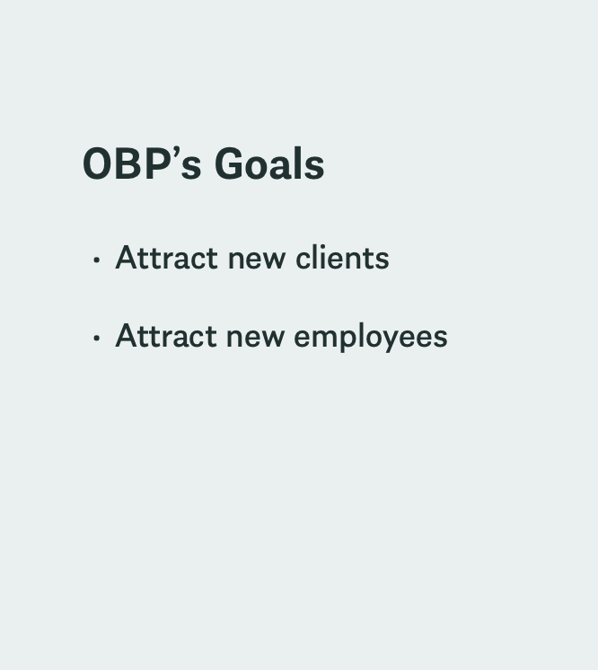
OBP is a full service advertising agency that relaunched its website in 2023 as part of its 35th anniversary celebration. Like many websites launching a product under a time limit, OBP decided to launch the minimum viable product. This meant that important features such as the work landing page (and the case studies that page linked out to) were left incomplete. As OBP’s primary goals at the time were attracting new clients and talent (i.e., expanding its workforce) - redesigning these pages in a timely manner was a priority.
the challenge
My Contribution
Site Audit | Thematic Analysis of User Research | Competitive Analysis | Content Hierarchy | UX Case Study Template | Wireframes | Heatmaps
UX Research
UX Research (completed by another team member)
Prior to OBP’s website redesign and launch, they did user research.
OBP interviewed 7 potential employees and clients.
The potential clients had recently asked OBP to submit RFP’s- so these potential clients knew what was most important to them when considering working with an agency such as OBP and why.
“Potential employees” that were interviewed were some of OBP’s newest employees- who had their reasons for joining OBP top of mind- as well as how the website contributed to their decision to join.
Reviewing the state of OBP’s redesigned case studies and case study template was a key starting point. I compared these to OBP’s user interview findings and found the following:
OBP was doing well at representing its impact, showing quality graphics of its work and keeping its case studies simple
OBP could be doing a lot better at: highlighting the quality of its work (vs. the quantity), articulating its capabilities, and highlighting what process it undertakes to complete its projects
Interview Findings
Competitor Research Findings
I next researched competitor case studies to determine where the competitors might be succeeding where OBP was not
Competitors succeeded by…
Highlighting research and strategy when explaining their work process
1
Using visuals to highlight their design ecosystem rather than just showing the final product
2
Highlighting the client (including testimonials, length of client/agency partnership & client value)
3
Sharing the services they provided at the beginning of every case study.
4
The following image is competitor research, not my work
Raxo highlights the design process
Raxo presents wires in medium fidelity form - engaging the user while still focusing on content structure
Raxo highlights its UX strategy
Brief notes alongside the wireframe highlight important design choices while considering the user’s cognitive needs
The following image is competitor research, not my work
Basic Agency highlights strategy work
Presenting research in a creative manner, using color and imagery to make the work more engaging
Helps clients visualize what types of strategy work might be done if they partner with the agency
UX Design
No list of services provided causing the user to be unsure about whether the content of the case study is useful
“Goal, challenge, insight and solution” are all listed in paragraph form on a gray background without any associated imagery, potentially increasing users cognitive load
No client testimonials. Including these could help potential clients understand why current clients value our contribution
Work samples are heavily image based and only images of the final work are shown. This does not meet user’s preference for understanding a project’s process
List of services provided quickly informs the user about whether the work in this case study is relevant to them
Work samples include images of process taken to complete project
“Insight and solution” are moved to the center of the case study and placed alongside images of work samples to decrease users cognitive load
Clients value highlighted, including testimonials and that clients successes (to show the agencies accomplishment by association with that client)
To help stakeholders get a better understanding of how the new content strategy would work, I redesigned a case study that is currently on OBP’s site using the above content hierarchy recommendations.
Visit Hannibal Wire Part 1
Placing images between copy wherever possible to help decrease the user’s cognitive load and increase scroll depth.
Visualizing strategic work alongside the final creative while enabling the user to use light boxes to see strategy in more detail
Enabling the user to toggle between wire and design to present UX strategy without visual distraction. When the user hovers over the information icon it tells them the difference between a wireframe and a design.
Visit Hannibal Wire Part 2
Notes next to hi fi design highlights visual strategy. Copy highlights on scroll to decrease cognitive load
Accessibility callout to highlight that this service is available at the agency and an important part of the design process.
Next, my findings, content hierarchy and updated wires were reviewed internally. Here is some of the constructive feedback I received from stakeholders:
A PM shared his concern that the case study was too long and that this might dissuade users from reading through it completely. So I reviewed heatmaps of key studies on the site to determine if this might be true. See below.
1
The marketing tech department head shared that the idea to include medium fidelity wires in the place of low fidelity wires would not work because clients might think that the med-fi work is what they would receive if they hired the agency.
2
Heatmaps
Findings
Users were not fully reading through case studies that required them to read large copy blocks that had no associated visuals
Users were reading the entire case study when shorter copy blocks with larger copy were mixed in with images
Recommendations
Wherever possible use smaller copy blocks
Mix in images with copy to decrease the user’s cognitive load
Next Steps
This is an ongoing project. Following the internal review I was tasked with applying this recommended content hierarchy and newly designed components to design a case study for OBP’s most recently launched website: Holiday World.
Project Team
SVP Strategy, Media, & Marketing Technology
Steve Kozel
Group Technology Director
Jason Wynne
Executive Creative Director
Jason Shipp
Project Manager
Jameson Elder
UX Designer
Jess Bellatti
UX Designer
Saameri Anderson
(202) 904 - 9865 saameri.anderson@gmail.com
Saameri Anderson


