
Morton Buildings CPQ Software Redesign
the challenge
Last designed in 2000 Morton Building’s CPQ software had a functional but outdated design that was difficult for new sales representatives to learn and use. CPQ stands for “configure, price, quote”. The software helps Morton’s sales reps build a visual of its buildings (fitted to the interests of a customer lead) to assist in converting that lead into a client.
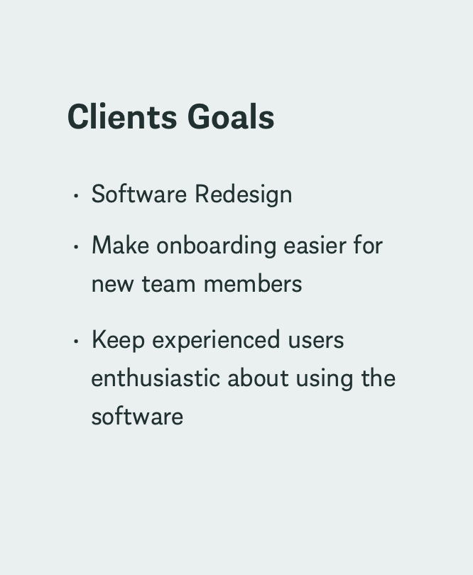
Morton asked my agency to update the software’s design to ease onboarding for new team members while keeping experienced users (who were generally opposed to software design changes) enthusiastic about the redesign. To accomplish this, Morton wanted a UX audit of the software, an updated information architecture, and two creative concepts. They planned to do the remaining design and development work in house.
UI Design (Desktop & Mobile) | 2 Concepts | User Interviews | Iconography | Font style | Color Palette | Competitor Research
My Contribution
Strategy
Jess Bellatti., the design lead on this project, completed all research alongside strategist Alex Menz until the concepting process began. As result of the quick turn around required for the concepts, my tasks were to quickly review the UX audit and competitor research, and recommended information architecture- before Jess and I both began the concepting process. We each designed one concept to present to the client over the course of 7 days.
Research
UX UI Design
First concept design
Each concept included wires and designs for the home page, the project setup page and the configurator. The primary function of the home page was to enable sales reps to review the full project list for current and previous customer leads. The primary function for the setup page was to enter the information required to begin the building design process. The primary function of the configurator page was to enable sales reps to design buildings to the specifications of their customer leads.
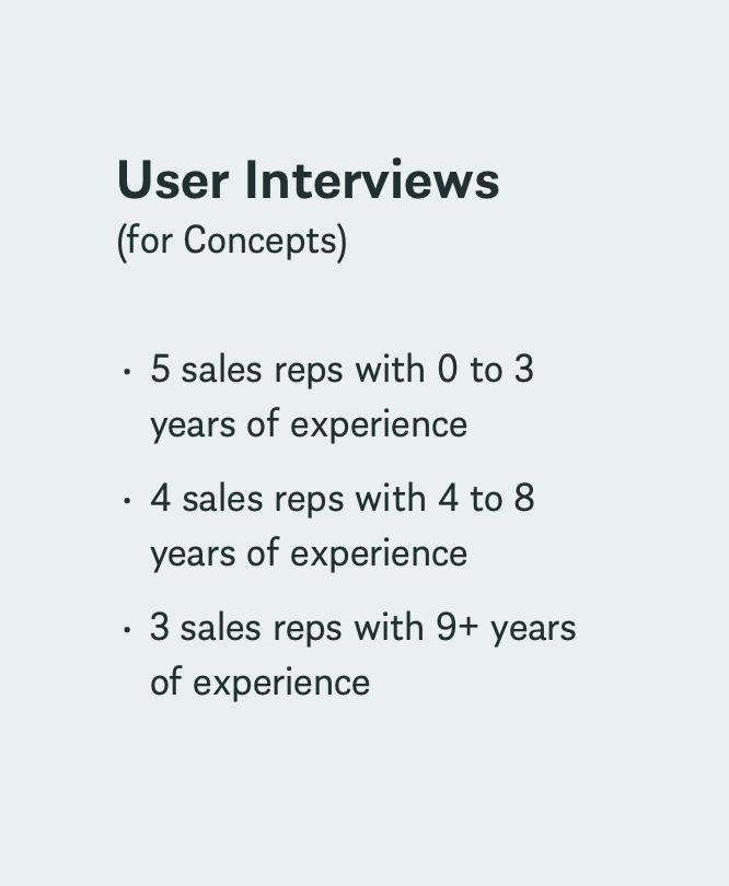
When the concepts were complete, Jess and I presented our respective concepts to 12 of Morton’s sales reps. Our goal was to understand their perceptions of each concepts’ look, feel, layout and functionality.
Home Page Wires & Designs
Including a list view grid view to help users quickly find projects while reducing cognitive load (in Morton’s original design, only a list view was available).
Most users preferred the option to have a grid view and a list view. Benefits they mentioned of including a grid view: quicker project recognition, easy way to show customers other projects for inspiration
Design Choices & User Feedback
Design Choices & User Feedback
Placing the project overview in front of an overlay and placing project details within an accordion to reduce the cognitive load that users might experience when viewing a lot of project details for one project next to their full list of projects (as it was laid out in the original design).
Users perceived that this design choice would make their experience harder because they would need to click more to find the content they needed and they wanted to be able to review that content as quickly as possible.
Project Setup Page Designs
Maintaining a mostly gray and white color scheme to be consistent with similar software setup experiences, while updating the layout to increase enjoyability and include some Morton branding.
Design Choices
Users were indifferent to the layout. But when pushed for their preference- it was a layout that was less “designed” and more simple and straightforward.
User Feedback
Configurator Page Wires & Designs
Prioritizing the user’s ability to see their design work by employing the use of iconography instead of words wherever possible to save space (with tooltips available on hover)
Design Choices
Enabling the user to add items to the building and edit existing items (such as doors) via a pop up that appears in the bottom center of the screen. This component can be maximized so the user can see all the content within it at once.
Users preferred this component to be on the side of the screen rather than the center, to maximize the visibility of their design. They also preferred not to use pop ups.
Design Choices & User Feedback
The background of the above component (labeled “configurator”) was designed with a glass effect (visualized in the video below). The intent here is to minimize any impression the user might have that too much of their design is being hidden when they use this component.
Users liked the inclusion of the glass effect: calling it modern, clean and futuristic.
Design Choices & User Feedback
Feedback, Summary & Concept Improvements
Following the presentation of my concept and Jess’ concept to 12 of Morton’s sales reps, we found that overall, they preferred the look and feel of my concept, while they preferred the layout and navigation of Jess’ concept.
We recommended that Morton move forward with the established look and feel of my concept with the inclusion of design choices that the users preferred from Jess’ concept. These updates included (but are not limited to) the following:
Home Screen
Allow the project overview details to open alongside the list of projects rather than in a modal overlay
Setup Screen
Ensure that the sub-navigation is visible at all times, and consider changing its placement on the screen
Incorporate more Morton brand red
Configurator Screen
Move the feature editor to the side of the rendering rather than in the middle or over the top
Results & Next Steps
Morton was so impressed with our team’s concept work that they asked
For it to be presented to their CEO
For my agency to complete all design work for the project (although their original ask only included work until the concepting phase was complete).
Next steps include finalizing the style guide and agreeing with Morton on a timeline to complete the full software redesign.
Project Team
Group Technology Director
Jason Wynne
Account Director
Krysten Maldonado
UX UI Designer
Jessica Bellatti
UX UI Designer
Saameri Anderson
Strategist
Alex Menz
Project Manager
Jameson Elder

(202) 904 - 9865 saameri.anderson@gmail.com
Saameri Anderson