When your curious, you find lots of interesting things to do - Walt Disney
Holiday World: Website Creative Concept

This project represented the chance to create a fun and unique experience for users while proving to my agency that I had the talent to do more creative work. So when I heard about the opportunity, I asked to contribute my first ever concept and was brought onto the team!
the challenge
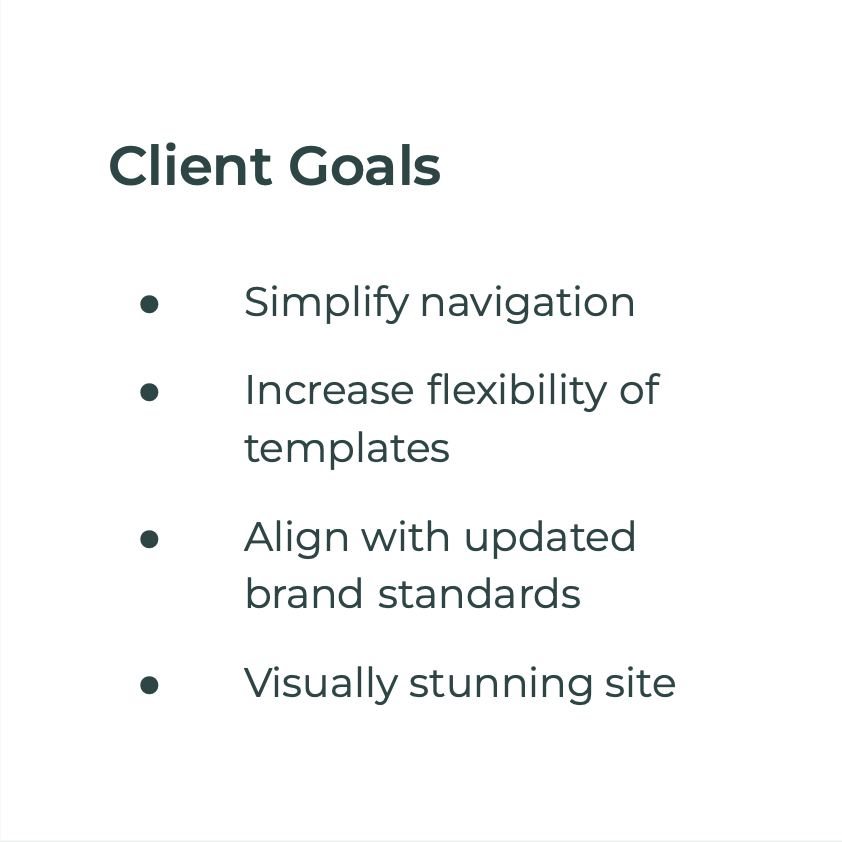
Last designed in 2014, Holiday World’s website had a navigation that was too confusing and templates that limited the company’s capacity to provide an experience that was intuitive and helpful to their users. Moving forward, they wanted a visually stunning site that aligned with their updated brand standards and was filled with fun playful elements that guests could interact with.


UI Design (Desktop & Mobile) | 2 Concepts | Illustration | Font style | Color Palette | Competitor Research | Iconography
My Contribution
UI Strategy
After taking a deep dive into Holiday World’s (then) current site, their RFP, brand guide, audience, and goals for the site, I was ready to hit the ground running. The first major challenge I faced was how to design the site using brand colors that seemed dated. Understanding that the client had recently updated their brand colors - instead of suggesting changes to them, I opted to find a strategy that would help those colors be visually appealing. While those colors didn’t work well on their own, I found that they looked fantastic as gradients. And the use of gradient became one of my primary design strategies for this project.
CLIENT RESEARCH & COLOR PALLETTE
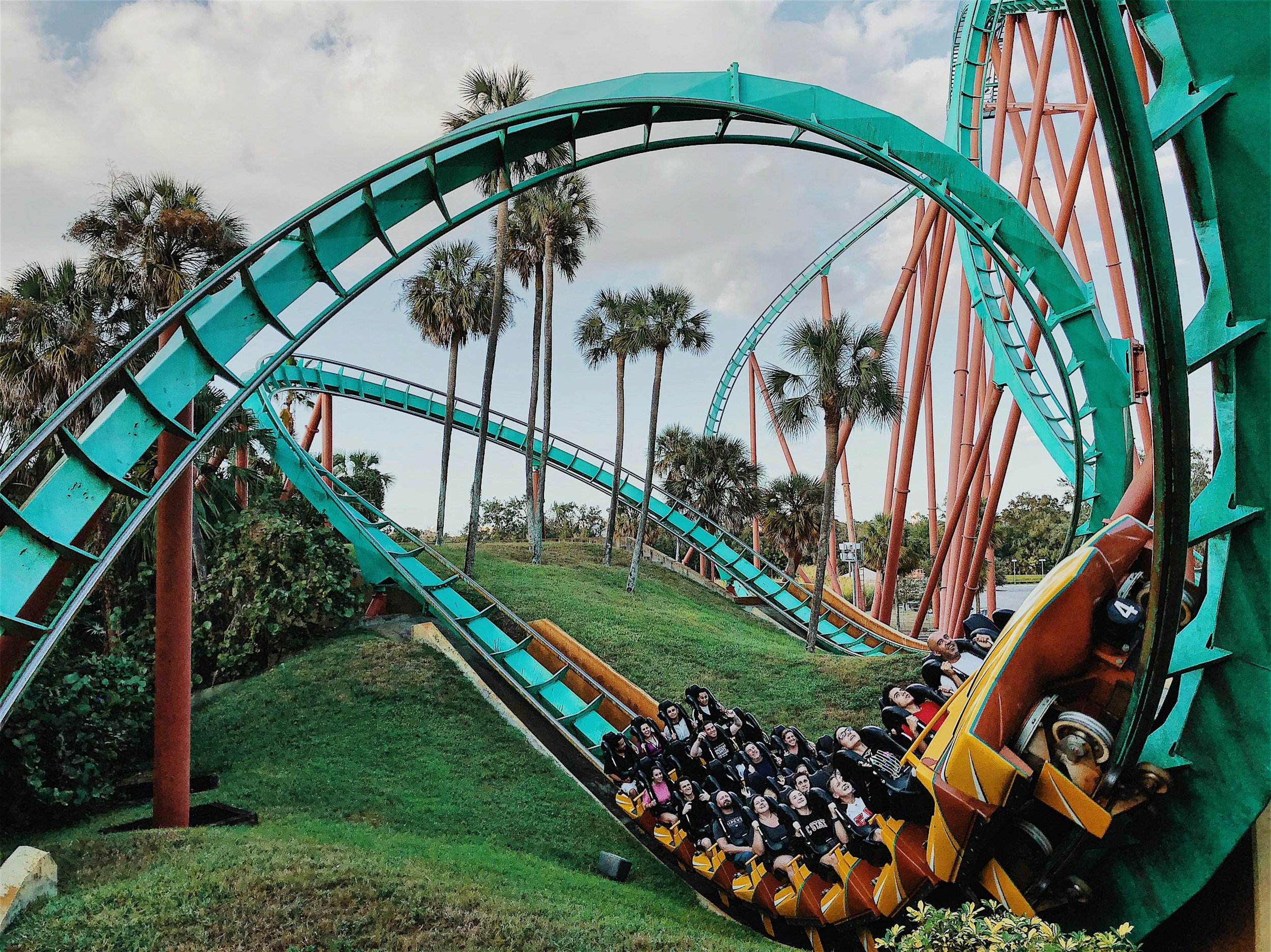
While considering how shape, line styles and component styles would form the foundation of this design strategy, I began competitor research. I started by looking at the best practices and design strategies of other theme park websites, Dribbble, and zoo websites (figuring that they had a primary audience that is similar to Holiday World’s).
COMPETITIVE RESEARCH & INSPIRATION
UI Design
When I had a foundational understanding of the visual style of this concept, I began transitioning the low-fi wires (completed by UX/UI designer Jessica Bellatti) into a high fidelity design.
Concept 1
Main Navigation

Main CTA incorporates the brand and changes to match the upcoming holiday (e.g. ghost for Halloween, Santa for Christmas)
The face of the ghost would follow the cursor around the navigation, and get excited when the user hovers over the main CTA to create a fun micro-experience for the user
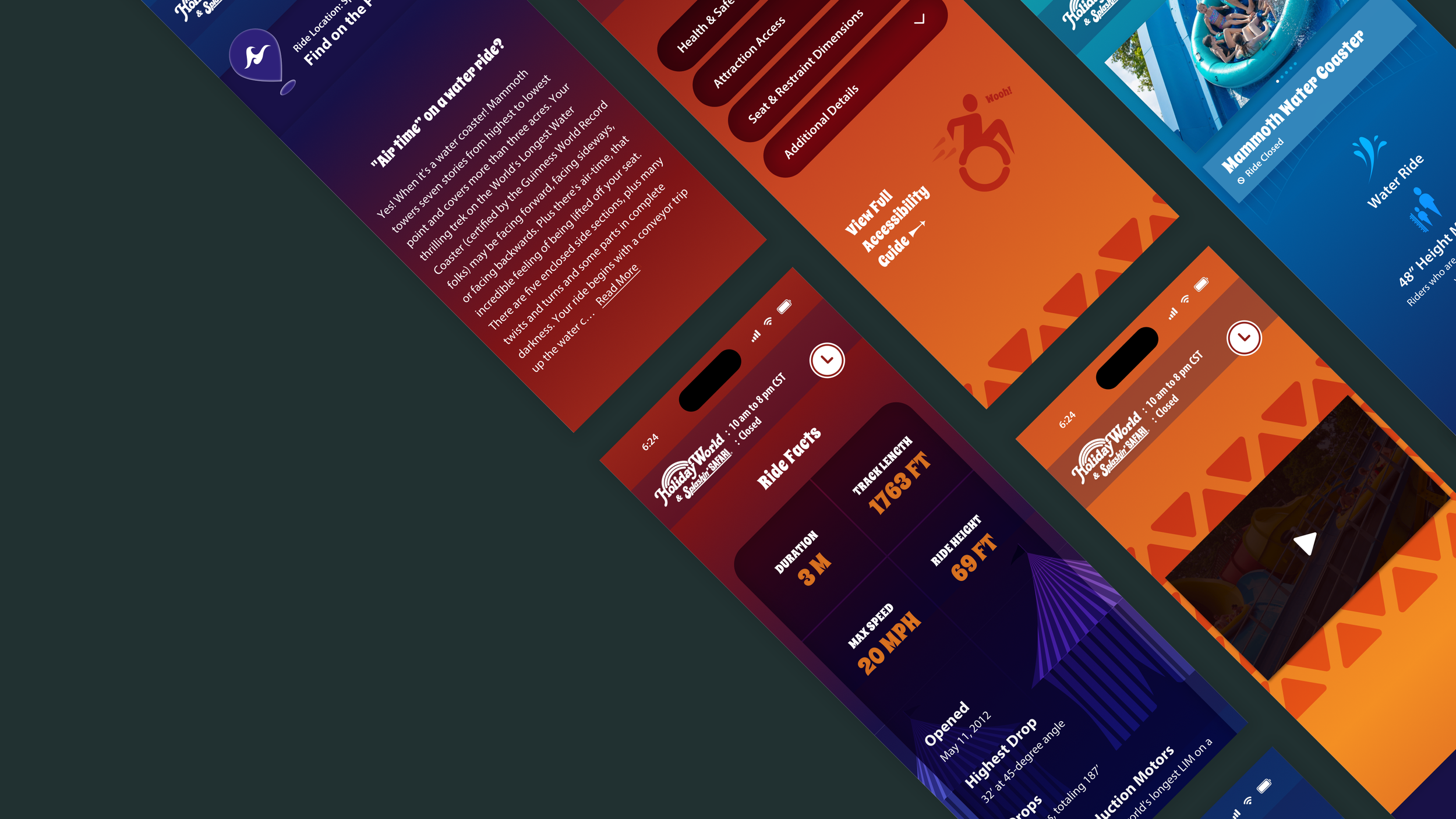
1st half of desktop design (Ride Page)

Subtle dot representing a roller coaster car follows the curve of this bridge as the user scrolls
2nd half of desktop design (Ride Page)

Ferris wheel circulates as the user scrolls
Blog cards have a forced scroll so the user can see them all before they can view the remainder of the page
During the internal review of this concept, the group’s creative director had two primary pieces of feedback:
1
Though he liked some of the subtle illustrated elements, he thought other illustrations felt a little disjointed and recommended making them as cohesive as possible.
2
He was also uncertain about the overall gradient approach. He thought it might not be very flexible across the entire site, and recommended adding more color blocking and/or white space
Design Challenges
His second point struck a chord with me. One of the client’s major asks was to have a flexible site. If the gradient approach limited template flexibility, it would not be useful for the client. I chose not to go in the direction of color blocking initially because of the types of colors in the brand guide. Also, adding more white was not a solution that harmonized well with the styles I had already established. The group’s creative director supported my continuing on with the concept I was already working with, or going in a new direction. So I opted for the latter.
Concept 2
While I maintained the strategy of using color gradients, interactive elements and theme park illustrations (as well as copying over the style of the main navigation), the second concept used a lot more white and minimal color blocking throughout the design. The main logo and main brand colors were used far more, and lighter hues of these colors gave the design a slightly more feminine feel which was fitting for the primary audience.
Cards with important updates for users have a forced scroll before the user can continue down the page

Yellow and red ball appears when the user’s mouse enters this component and inverts the colors of any icon the mouse hovers over.
The ball merges into the full screen gradient below it on scroll, and disappears.

Yellow and red ball emerges from the full screen gradient above it, follows the user’s mouse through the “shows that wow” component, and fades away at the beginning of the “real life can wait a while” component
Unfortunately, when seeking feedback for this concept from the group’s creative director, I got very little. So while concept 1 went through a number of iterations based on feedback, concept 2 was presented to the larger internal team in its original form.
CONCEPT 2 FEEDBACK
RESULTS
Following the presentation of this concept to the internal team, I was informed that this concept had not been chosen to be presented for client review. The client went in another direction for the new design of their site.
Learnings & Opportunities for Improvement
Stay away from designs that are single use, and design as much as possible for the template, to make the site easy for the client to update over time
Double check with relevant experts that perceived problems are real when there is feedback given that a design choice might not work (for a matter that is not the feedback giver’s area of expertise).
Project Team
Group Technology Director
Jason Wynne
Group Creative Director
John Hansen
Project Manager
Jameson Elder
Copy Writer
Chris Smith
UX Designer
Jess Bellatti
Concept Designer
Dan E.
Concept Designer
Anna Karpinski
Concept Designer
Saameri Anderson

Saameri Anderson
(202) 904 - 9865 saameri.anderson@gmail.com